Stay in touch with the latest news from AIM and get information on sector grants, jobs and events with our free fortnightly E-News.
Text writing
Before you start, decide on the hierarchy and format for the text that you are writing. This might include objects labels, graphic panels and digital content. It is also important to agree a tone of voice; describe it so that you can picture it each time you write text. If more than one person is contributing text for one gallery it can be helpful to have one editor who can adjust the text, so it has one clear voice. It can also be helpful to agree some rules, such as terminology or a glossary so the text is consistent, for example, how will you present dates: the 1800s or the 19th century?
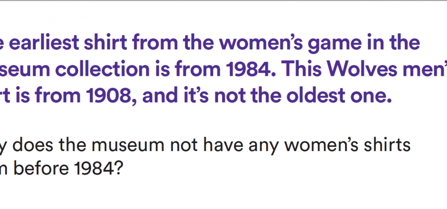
Object labels are often printed and put alongside the object or can be referenced using a number by the object with information placed near the showcase. One object label can also be used to give information about a group of objects together. The title should be bigger than the rest of the text and doesn’t need to be the name of the object, it could be a question or a fact about the object. The remaining text might tell visitors about the manufacture of the item, who owned it, how it was used, how it relates to other objects or why it’s important, unusual or significant. Ideally an object label should be 30-50 words, printed in a non-serif font and at least point size 16. Below is an example object label from the National Football Museum.

Graphic panels
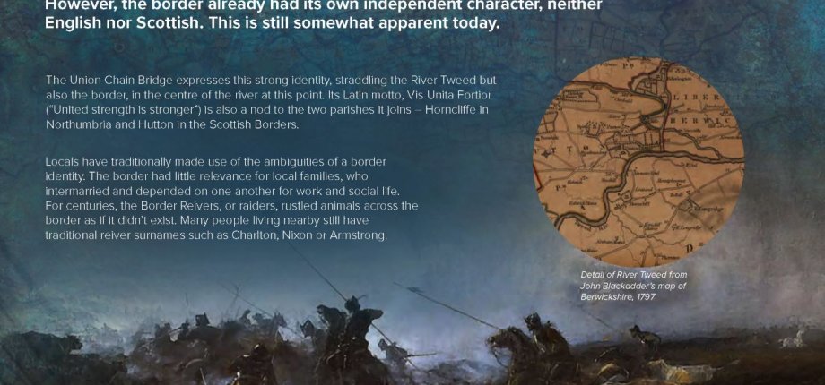
Graphic panels should be carefully designed to make sure that the information is at the correct height. The font should be a non- serif font and point size 40 (or 30 if the panels are smaller and close to visitors). The title should be attention grabbing and fit with the titles of the other panels, so they feel like a set. The first paragraph should be less than two sentences and should grab the attention of the reader, whilst giving enough information to make sense if they don’t read any further. The main body of the text follows on and should provide further detail. Each graphic panel should have less than 150 words (less if it is bilingual).
Digital content can be slightly longer, especially if users are likely to read it at home, sat down. It can provide more in-depth information but needs to be in short chunks with a clear hierarchy and a clear route to find the information.
For museums in Wales, all information will need to be bilingual and could use terms and phrases relevant to the local area. Make sure that both languages are given equal weight and consider using a professional translator who will write (rather than translate) the text in Welsh. There may be other places where information will be provided in more than one language. The Scottish Government have guidance on using Gaelic and Scots languages, but it is not compulsory. It is important to ensure that it is easy for visitors to work out how to find their language of choice. Bilingual graphic panels work well if the information is placed carefully
alongside each other.
Principles for text writing:
- Use simple language to express complex ideas
- One idea per sentence
- Use the active form of the verb and ask questions, admit when you don’t know something
- Read texts aloud and note natural pauses (use a full stop at this point)
- Remember that visitors will probably be reading this while in the gallery, not sat in an armchair
- Grab the reader’s attention at the start (it’s not an essay with an exciting climax)
- Find a unique perspective and tell us something we don’t already know
- Remove superfluous words and keep it concise.
To find out more about text writing in museums take part in a course.
See an example graphic panel below from Union Chain Bridge:

